
Before a linen sample reaches the hand, a surprising amount can already be understood.
Surface and movement reveal character. Weight and width provide practical context. Construction and finish help explain why fabrics that appear similar may behave differently.
Together, these signals can move a professional from broad interest to a more relevant first selection. The objective is not to make a final decision from a screen, but to arrive at physical consideration with clearer priorities, better questions and fewer irrelevant options.
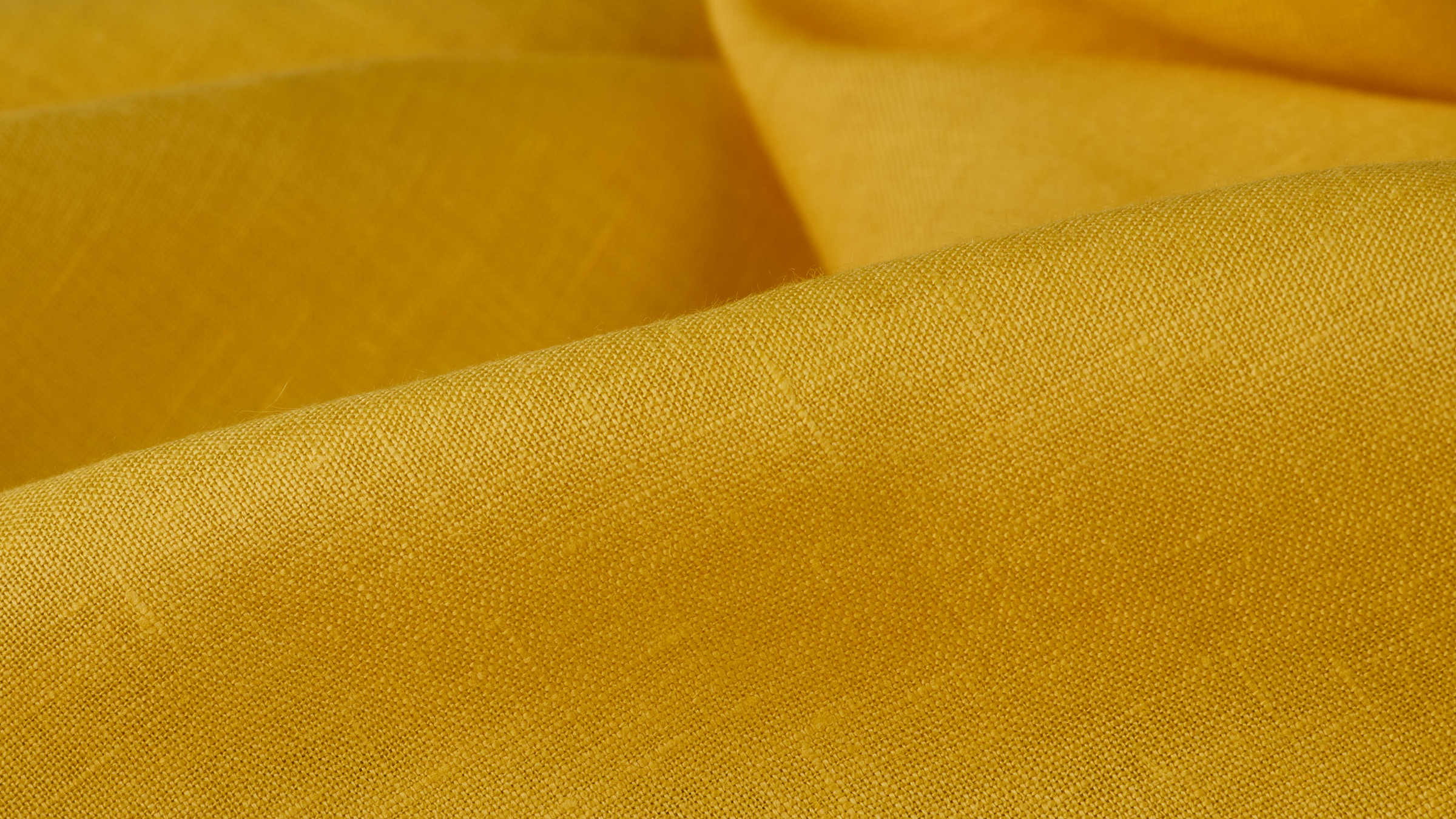
Color may create the first impression, but surface often reveals more about the character of a linen.
Look at the relationship between yarn, weave and light. Is the weave open or compact? Is the surface smooth, softly irregular or strongly textured? Are the yarns quiet or intentionally visible? Does the fabric appear subtle from a distance or create a clear material presence?
A useful digital presentation includes several views. A full portrait shows overall character, a macro reveals yarn and weave, and a fold introduces dimension.
Do not ask only, “Is this the right color?” Ask, “What kind of surface will this color inhabit?”
A flat image describes surface; movement begins to show how a material occupies space.
Observe what happens when the linen is folded, suspended or allowed to fall. Does it create soft, rounded folds or hold a sharper line? Does it collapse easily or retain visible body? Does the surface change as it passes through light?
For Interior professionals, movement helps distinguish a soft fall from a more structured presence. For Fashion professionals, it begins to suggest fluidity, volume, ease or tailoring potential.
When comparing materials, view them under similar conditions whenever possible. Consistent presentation makes real differences easier to understand.
Fabric weight, commonly expressed in ounces per square yard or grams per square metre, helps place linen within a broad physical range.
A lighter linen may suggest transparency, ease or fluidity. A heavier linen may suggest more body, opacity or structural presence. But two fabrics of similar weight can behave differently because of yarn, weave, density and finish.
Most importantly, greater weight does not automatically mean greater durability. Performance must be supported by construction, testing and documented information, not inferred from weight alone.
Weight becomes useful when read beside movement, construction, finish and intended application. It narrows the field; it does not make the decision.
Width is more than a secondary specification. It can influence design, construction, efficiency and cost from the beginning.
For Interiors, width may affect seams, panel planning, repetition, upholstery layout and total material requirements. For Fashion, it influences marker planning, cutting efficiency, proportions and yield.
When evaluating linen, ask:
A material can be aesthetically right and operationally wrong. Considering width early protects the design from avoidable compromises later.
Construction describes how the fabric is made: its yarns, weave, density and structural relationship. Finish refers to processes applied to influence qualities such as hand, softness, surface, appearance or dimensional behavior.
The distinction matters because finishing can significantly change how a construction is experienced. Two linens may share a similar composition and weight while presenting different movement or surface character.
Place three questions together:
Construction, finish, performance and certification information must apply to the exact material or colorway being considered. Visual similarity does not guarantee identical technical behavior.

Once these five signals are visible, comparison becomes more useful. The objective is not to display every specification, but to identify the differences that matter to the project.
Begin with three questions:
Define essential requirements such as width, opacity, movement, structure, documented performance or project conditions.
Identify the desired expression: quiet surface, visible texture, relaxed movement, architectural body, refinement, contrast or depth.
List what requires the hand, project light or direct interaction: exact color, hand, softness, transparency, scale or its relationship with other materials.
Instead of asking which linen is universally better, ask:
Which linen is more relevant to what this project needs?
This is the practical advantage behind the Lusso Fabrics Digital Showroom.
A professional can discover materials through consistent imagery, read the relevant context, compare meaningful differences and remove options that do not meet the project’s essential criteria. The result is a smaller, more purposeful first selection for physical confirmation.
The benefit is not simply convenience. It is a better sequence of attention.
Rather than requesting many materials to discover what they are, the professional can begin by understanding why each one may matter. Physical consideration then becomes more focused, and the reason behind every selected fabric remains connected to the project.
Linen still rewards direct experience. Its hand, subtle color variation and response to light belong to the physical material.
But the first decision does not have to begin without information.
Learning to read surface, movement, weight, width, construction and finish creates a stronger first selection and a more informed transition from screen to hand.
The Lusso Fabrics Trade experience opens September 9.


